How to Prepare Print Files Without Rejections
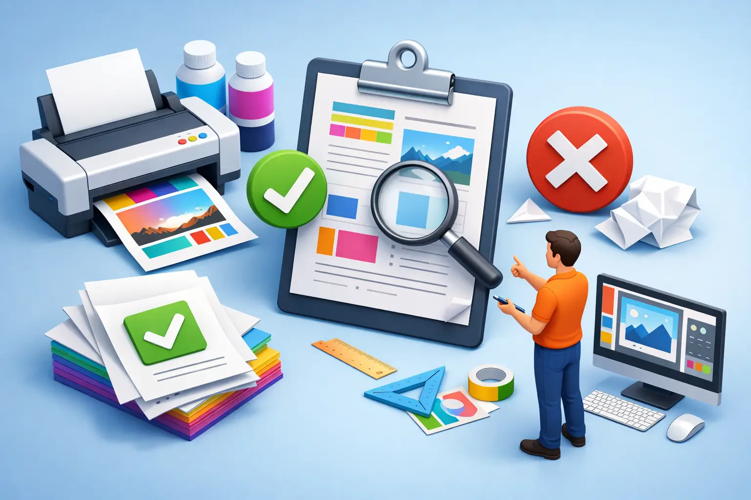
A book can look finished on your screen and still fail at the printer. That gap is exactly why authors keep searching for how to prepare print files after a rejection email lands. Usually, the problem is not the writing. It is a trim mismatch, a spine width error, low-resolution images, bad margins, or a PDF export setting that looked harmless until a platform flagged it.
If you want to self-publish without the rejections, treat print prep as a production step, not an afterthought. A print file is not just your manuscript saved as a PDF. It is a set of decisions that have to match the printer’s specs, the physical behavior of paper, and the metadata attached to the book.
How to prepare print files the right way
The cleanest way to approach print prep is to think in two separate files: interior and cover. They follow different rules, fail for different reasons, and should be checked independently before upload.
Your interior file handles readability and manufacturing accuracy. Your cover file handles dimensions, barcode space, bleed, and spine calculation. When authors combine those concerns too late, errors stack up fast.
Start with the trim size, not the formatting
Before you adjust margins, fonts, or page breaks, lock your trim size. That single choice affects almost everything else, including page count, spine width, and how your book feels in hand. A 5.5 x 8.5 novel and a 6 x 9 memoir may use the same text, but they are not the same production job.
This is where many print problems start. Authors format a manuscript at one size, then switch trim sizes near the end to meet market expectations or reduce printing cost. That change can throw off page count, widows and orphans, image placement, and spine measurements. Pick the trim first, then build the layout around it.
Set margins for print, not for a document editor
Printed books need inside margins that account for binding. That means the gutter matters. If the text sits too close to the spine, the book may technically print but still look amateurish and read poorly.
Outside, top, and bottom margins need balance too. There is no single perfect number because it depends on trim size, genre, and page count. A dense academic title may tolerate a tighter layout than a memoir meant to feel open and readable. The trade-off is simple: tighter pages lower page count, but they can also hurt readability and visual polish.
Use fonts and spacing that survive export
Print-safe formatting is more conservative than screen-first formatting. Decorative fonts, inconsistent paragraph spacing, and manual line breaks often create avoidable issues in PDF export. Stick with professional, readable typefaces and define styles consistently across body text, headings, scene breaks, and front matter.
Just as important, embed your fonts when exporting the PDF. If a font is missing or substituted, your text can reflow, your pagination can change, and the uploaded file may no longer match what you approved.
Interior file requirements that cause the most trouble
Most rejected interiors fail on a handful of recurring issues. The details vary by platform, but the pattern is consistent.
Page size must match the upload settings
If your PDF says 6 x 9 but your upload settings say 5.5 x 8.5, the platform will flag it. This sounds obvious, yet it happens constantly because authors reuse old setup data or export the wrong version of the file.
The same goes for bleed. If your interior includes full-page images, chapter art that reaches the edge, or any design element intended to print to the edge, you need bleed enabled and sized correctly. If you do not need bleed, do not turn it on just because it sounds more professional. Wrong bleed settings create their own problems.
Images need print resolution
An image that looks sharp on a laptop may still be too low resolution for print. For most book interiors and covers, 300 DPI is the safe baseline. Anything lower can produce fuzzy photographs, muddy graphics, or soft text inside images.
Black-and-white printing adds another variable. Grayscale images often reproduce differently on paper than they do on screen. If your book depends on charts, photos, or tonal detail, test carefully. Some files are technically valid but still disappoint in physical print because the contrast is too weak.
Blank pages and page order need a reason
Front matter, chapter starts, and right-hand page conventions matter in print. A blank page is not automatically an error, but it should be intentional. If your file has accidental blanks from section breaks or manual pagination fixes, clean them up before export.
Page numbering also needs discipline. Roman numerals in front matter and Arabic numerals in the main text are standard in many books, but standards are only useful if they are applied consistently.
How to prepare print files for the cover
Cover files are where confidence tends to collapse. The front may look perfect, but the full wrap requires exact math. One small miscalculation can shift the spine text, clip the back cover, or leave important elements inside the trim line.
Build the cover as a full spread
For paperback printing, the cover is usually delivered as one full PDF spread that includes back cover, spine, and front cover. The width depends on your trim size, bleed, and final page count. The spine width depends on the paper type and number of pages, which means you should not finalize the cover before the interior is locked.
This is one of the biggest sequencing mistakes in self-publishing. Authors design the cover too early, then make interior changes that alter the page count. Even a small shift can change the spine enough to cause rejection or visible misalignment.
Respect the safe zones
Every cover has trim lines, bleed, and safe areas. Important text should stay well inside the safe area. That includes subtitle copy, author name, series labeling, and any design detail that should not feel crowded at the edge.
Barcode space matters too. If the printer places a barcode in a designated area, do not treat that area as usable design real estate. A strong back cover is not just attractive. It is production-aware.
Check color settings before export
Color can be tricky because screens are bright and paper is not. Some platforms accept standard PDF exports that began in RGB, while print production generally behaves more predictably when color output is handled with print in mind. The practical point is this: do not assume your screen colors are your print colors.
If your cover relies on subtle gradients, deep blacks, or very dark imagery, inspect those choices carefully. What looks rich on screen can print flatter than expected. Validation can catch file compliance issues, but visual judgment still matters.
Validation is not optional
Learning how to prepare print files is really about reducing failure points before submission. That is where validation earns its keep. You want a system that checks dimensions, bleed, margins, image resolution, and platform-specific requirements before you upload, not after a retailer rejects the job.
For serious indie authors, this is more than convenience. It is schedule protection. Rejections delay launches, force rushed fixes, and create version confusion across your interior, cover, and metadata. A single workflow that lets you write, design, format, export, and validate in one place is faster because it removes handoff mistakes. Tunmire is built around that exact problem.
A practical preflight before you submit
Before sending files to KDP or IngramSpark, do one slow final pass. Confirm the trim size in your file matches the trim selected on the platform. Confirm the page count used for the cover matches the final interior PDF. Check that fonts are embedded, images are high enough resolution, and no text sits too close to trim lines or the gutter.
Then review the book as a physical object, not just as a document. Flip through the PDF page by page. Look at chapter openings, headers, footers, running page numbers, and image placement. Read the spine width as a manufacturing detail, not a design guess. Most preventable rejections are visible if you stop treating export as the finish line.
The hard truth is that print readiness is less about talent and more about discipline. A strong book deserves a file package that can survive production on the first try. Get that part right, and you keep control of your timeline, your standards, and your launch.
Last updated July 21, 2026
← All posts