Book Cover Design Software for Authors: What to Look For
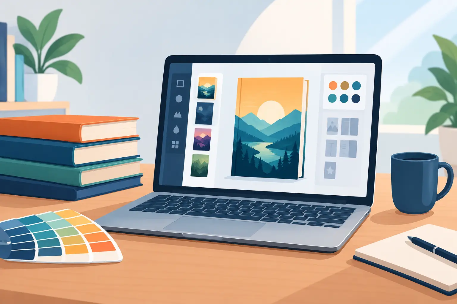
The right book cover design software gives you creative control over the image and type, but also produces files that actually work: a crisp ebook thumbnail, a full print wrap, a series-consistent paperback, and promotional art that still looks like your book. The wrong one gives you a handsome image that falls apart the moment it reaches a printer, a retailer, or a social post.
What Authors Actually Need From Cover Software
A cover is not just an image with a title on it. It's a production asset with technical requirements, market expectations, and a direct relationship to your manuscript. Good software helps you manage all three.
Start with creative control. You should be able to set the atmosphere, character presentation, setting, color palette, title treatment, and the hierarchy between author name and title. If a generated face doesn't match the protagonist on the page, or a stock image sends the story into the wrong genre, the software should make revision easy rather than forcing you to accept a near miss.
Then think about production readiness. An ebook front cover is not the same file as a paperback cover. Print needs a spine, back cover, bleed, safe margins, and a trim size that matches the printer's specifications. Spine width changes with page count and paper choice. A tool that only makes a front image can be fine for early concepting, but it won't carry a book through publication on its own.
Finally, think past launch day. You'll likely need ad graphics, a boxed-set variation, an audiobook square, translated editions, or art for a trailer. Rebuilding the look from scratch in separate apps wastes time and invites inconsistency.
Core Features to Check
Not every author needs every feature. A memoir with a photographic treatment has different needs than an epic fantasy series with maps and recurring characters. Still, a few things separate a casual design tool from real cover-production software.
Do the templates guide you, or trap you?
Templates are useful when they reflect common publishing formats and give you a sensible starting structure. They become a problem when every cover ends up with the same oversized script font, generic silhouette, or crowded badge.
Look for templates flexible enough to let you change typography, composition, and image treatment without breaking the layout. The goal isn't to make your book look like a template — it's to avoid preventable mistakes while still making the design your own.
Can you actually control the type?
Readers often read the title before they read the artwork. At small sizes, decorative lettering turns to mud, thin fonts disappear, and poor contrast turns a strong concept into an unreadable thumbnail.
Your software should let you test title size, spacing, alignment, shadow, and contrast against the real cover image, and build a clear hierarchy: title first, author name where it belongs for your market position, subtitle or series info only when it helps recognition. A debut author may need a different balance than an author with an established audience.
Can you revise the image, not just place it?
Whether you start with licensed imagery, original artwork, AI-assisted concepts, or a mix, you need real editing controls: cropping, layers, background removal, color adjustment, masking, and text-safe composition.
AI image generation is useful for exploring mood, location, or symbolic ideas, but check it carefully. Ask whether a character's age, clothing, and expression match the manuscript. Check hands, props, architecture, and lettering. A striking image that contradicts the story can weaken reader trust before chapter one. A picture editor built for this, like Theoria, lets you find the subject, remove a background, erase and fill, or generate an image from a description without leaving the project.
Does export cover both print and ebook properly?
A publication-ready tool supports the dimensions and resolution your distribution path needs. For print, that means a full wrap with correct bleed and safe areas, exported at high resolution. For ebook storefronts, it means a sharp front-cover file that stays legible at small sizes.
You should also be able to revise without starting over. If interior edits change the page count, your spine needs to change too — that's a normal production step, not a reason to rebuild the cover.
Choose a Workflow, Not Just a Design Canvas
Many authors cobble covers together: draft the manuscript in one place, source images elsewhere, design the cover in another app, calculate the spine in a printer template, then build promo graphics in yet another tool. Every handoff invites version confusion.
The real question isn't just "can this software make a good cover?" Ask what happens after the cover is approved. Can the finished art move into a print layout? Can an approved character image reappear in an audiobook campaign without being recreated? Can you find the current logo, font, manuscript version, and cover file when it's time for a translated edition?
An integrated workspace cuts those risks down. In Tunmire, Iris builds covers for paperback, hardcover and ebook using images from your gallery, and the same project can move on to interior layout, audiobook, trailer, and translated editions. A book is rarely one file — it's a growing set of coordinated assets.
A Practical Cover Production Process
Write a short cover brief before opening any design tool. Define the genre, ideal reader, central promise, comparable visual conventions, and anything that must not appear. A psychological thriller may call for tension, negative space, and restrained color. A cozy mystery may need warmth, place, and a clear invitation to the reader. The goal isn't to copy competing books — it's to speak clearly to readers already looking for yours.
Develop two or three directions rather than polishing the first idea: one character-led, one symbolic, one typography-led. Compare them full size and as tiny thumbnails. If the title vanishes or the genre signal disappears at thumbnail scale, revise it early.
- Build the front cover first: set the visual focal point, title hierarchy, and author name.
- Build the print wrap around your final trim size and page count.
- Reserve safe space for the barcode and back-cover copy, and keep important visual details out of the spine or trim edge.
- Run a final check: spelling (especially names and series labels), color and image quality at different sizes, and the back cover and spine with the same care as the front.
- Keep editable source files alongside the finished exports — you'll want them for Book Two.
When Is Simpler Software Enough?
A lightweight design tool is a reasonable choice for an early mockup, a pitch concept for beta readers, or simple social graphics to sit alongside a professionally designed cover. It can also work for a short ebook with a clean, typographic design and no print edition planned.
The trade-off shows up as the project gets more complex. Series branding, full wraps, frequent format changes, multilingual editions, and coordinated marketing reward software that treats design as part of a larger publishing workflow. Spending less upfront can cost more later if you end up rebuilding assets or paying someone to fix avoidable file problems.
Your cover doesn't need to explain the whole story. It needs to make the right reader pause, understand the promise, and want the next click. Choose software that gives you that precision, and keeps the approved design connected to every version of the book you bring to life.
最后更新于 十一月 13, 2026
← 所有文章