How to Format a Manuscript for Paperback Printing
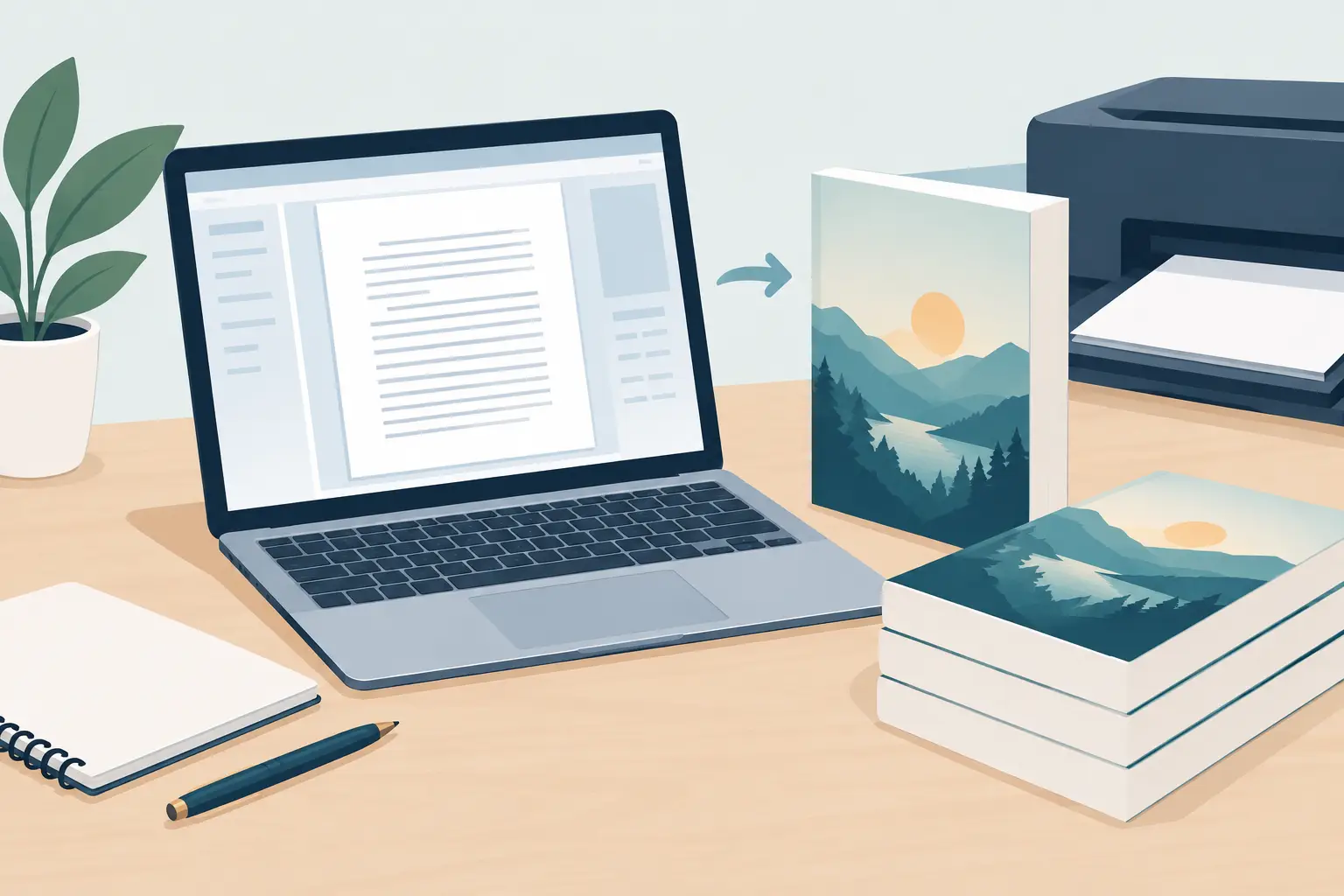
A paperback interior can look polished on screen and still fail the moment it becomes a physical object. A narrow inside margin can swallow words near the binding. A stray blank page can push a chapter opener to the wrong side. To format a manuscript for paperback printing, you need to make decisions for a reader holding the book, not just a document editor displaying it.
Your manuscript remains the source of truth. Formatting should clarify the reading experience, protect your voice, and create a file a printer can produce consistently. Treat it as a production stage with creative consequences: the typeface shapes the mood, the page rhythm affects pacing, and the trim size tells readers what kind of book they are about to enter.
Where do I start?
Start with the printer's production specifications, not a favorite font or a template from another author. Every print-on-demand service and offset printer has its own supported trim sizes, minimum margin rules, bleed requirements, and file standards. Those rules determine the safe design space for every page.
Create a separate working copy of your edited manuscript before you apply layout styles. Do not use manual spaces, repeated tabs, or empty paragraphs to force text into place. They may appear to work in a word processor, then shift when the file is exported or opened on another system. Use paragraph styles, page breaks, section breaks, and alignment controls instead.
This distinction matters because a paperback is not a stack of independent pages. It is a bound object. Its page count affects spine width, its binding affects the inside margin, and its paper choice affects how the text shows through from the reverse side.
Choose trim size before you design the page
Trim size is the final width and height of the book after it is cut. A 5.5-by-8.5-inch or 6-by-9-inch trim is common for US trade paperbacks, while genre expectations can guide the decision. Compact romance, crime, and literary fiction may feel at home at a smaller trim. Business books, guides, and books with diagrams often benefit from the extra room of a larger page.
There is a trade-off. A smaller trim can feel more intimate and may use less paper per page, but it generally increases page count and demands more careful line length. A larger trim lowers page count but can make a short novel appear slight. Before committing, estimate your formatted page count with real typography rather than relying on the word count in your manuscript file.
Keep the trim size consistent with the cover plan. The cover's spine cannot be finalized until the interior page count and paper stock are known.
How should I set margins for binding?
Margins give the page air, but the inside margin, often called the gutter, performs a practical job: it keeps text readable near the spine. A book with 80 pages does not need the same gutter as a 450-page novel. As page count rises, the binding takes more of the inner page area, so the gutter usually needs to grow.
Set top, bottom, outside, and inside margins separately using mirrored margins or facing pages. This ensures odd and even pages mirror each other correctly. Avoid treating the left margin as permanently inside and the right margin as permanently outside. That works only on one side of a spread.
Printers publish minimum requirements, but minimum is not always comfortable. If a dense nonfiction book has long headings, tables, footnotes, or frequent callouts, give those elements more room. A layout can technically pass a printer check and still feel cramped to a reader.
Headers and footers also need their own safety zone. Put page numbers far enough from the trim edge that small cutting variation will not make them look crooked or crowded. For most books, the first page of a chapter does not carry a running header, but conventions vary by genre and publisher style.
What typography works for a printed book?
Body type is a reading tool, not a branding stunt. Choose a legible serif typeface for long-form print unless the book's subject or visual identity gives you a strong reason to do otherwise. Size, leading, paragraph spacing, and line length work together. Changing one changes the page's density and often changes the final page count.
For a standard paperback novel, a body size around 10.5 to 12 points is a practical starting range, but the right choice depends on the typeface's x-height and width. A font that looks small at 11 points may read larger than another at 12. Print a few representative pages at actual size before deciding.
Use a first-line indent for regular body paragraphs rather than inserting a blank line between every paragraph. Do not indent the first paragraph after a chapter heading, scene break, block quote, or subhead. Keep those rules consistent through paragraph styles. Readers may never articulate why a well-set page feels calm, but they notice when its patterns break.
Avoid full justification without professional hyphenation and spacing controls. Justified text can look elegant in print, yet weak settings create distracting rivers of white space. Left-aligned, ragged-right text is often the safer choice for a straightforward production workflow. If you choose justification, inspect every page in the final PDF.
How do I organize front matter, chapters, and back matter?
Paperback pages have an expected order. Your front matter may include a half title, title page, copyright page, dedication, epigraph, table of contents, foreword, or preface. Not every book needs every element. A fast-moving novel does not need ceremonial pages simply because another kind of book uses them.
Use a section break when the numbering or header treatment changes. Front matter may use Roman numerals or may not display page numbers at all, while the main text usually begins with Arabic page 1. If your printer counts every physical page, remember that a hidden page number does not mean the page disappears from the count.
Begin major divisions, such as chapters and parts, on right-hand pages when your genre and budget support it. This may introduce intentional blank pages. Those pages should be truly blank, with no header, footer, or accidental paragraph mark. For books where every page matters, beginning chapters on the next available page is a reasonable production choice.
For scene breaks, use a consistent centered ornament, three asterisks, or extra vertical space. Never rely on several empty returns. Reflow can turn those returns into an awkward hole at the top or bottom of a page.
How do I fix widows, orphans, and other bad breaks?
A finished paperback should avoid widows and orphans: a single last line of a paragraph stranded at the top of a page, or a single first line left at the bottom. Also watch for a heading at the bottom of a page with no following text, a chapter title followed by only one line, and a scene break that lands alone.
Solve these problems with paragraph controls first. Keep headings with the following paragraph, keep selected paragraph lines together, and control widow-orphan settings through styles. Resist the temptation to add returns or resize random paragraphs. Local fixes tend to cause new problems later.
Review the first and last page of every chapter. These are high-visibility pages where a bad break, uneven spacing, or missing header becomes especially obvious. Then review full two-page spreads. A single page can look balanced by itself while the facing pages reveal uneven density or misplaced elements.
What should I check before uploading the file?
Export the interior as the exact PDF format requested by your printer, usually with fonts embedded. Then inspect the exported PDF, not only the layout file. Export can change line wraps, transparency, image resolution, and font behavior.
Before upload, check these production details:
- The PDF page size matches the chosen trim size exactly.
- Page count, cover spine calculation, and interior file all reflect the same edition.
- Images are high enough resolution for print and remain sharp at their final placed size.
- Black body text is set for crisp black printing, not a four-color build.
- No live comments, tracked changes, placeholder text, or blank accidental pages remain.
Order a physical proof whenever possible. Screen review catches technical errors; a proof catches tactile ones. Read a few pages under normal light, open the book near the middle to test gutter comfort, inspect grayscale images, and look at the cover and interior together. A proof is where you learn whether the choices serve the actual book rather than the file.
How do I keep later formats connected to this file?
If your manuscript will also become an EPUB, audiobook, translated edition, trailer, or series asset, preserve clean structural styles from the start. Chapter headings, scene breaks, block quotes, and image captions should have meaningful formatting, not visual workarounds. That structure makes later production more reliable and protects consistency across editions. Apollo can hold the manuscript as you build these styles, so the structure stays intact as you keep writing and revising.
When the interior is ready, Forge lays out the manuscript and exports a print-ready PDF and a validated EPUB from the same styled file, which is one way to keep the paperback and ebook editions in step. But the author still makes the calls: approve the layout, inspect the proof, and decide when the book is ready to become an object readers can keep.
The last useful test is simple: print several pages at actual size, place them in a mock cover or fold them like a book, and read without looking for mistakes. If the page disappears and the story remains, your formatting is doing its job.
最后更新于 十一月 16, 2026
← 所有文章