How to Create Print Ready PDFs for Your Book
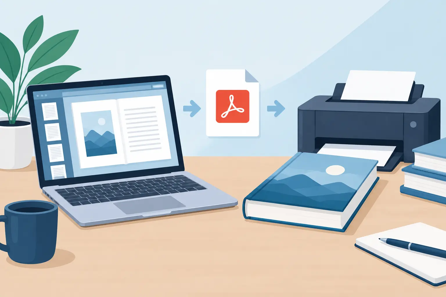
A print file can look perfect on your screen and still fail at the printer. A missing bleed, a font substitution, a low-resolution image, or a page count that conflicts with the binding method can turn a finished manuscript into a costly delay. To create print ready PDFs, you need more than a document export. You need a controlled production file built for the specific physical book you intend to manufacture.
For independent authors and small publishing teams, this is where production discipline protects both the reading experience and the release schedule. A print-ready PDF tells the printer exactly what to reproduce: page size, image quality, color behavior, fonts, margins, and every element that reaches the edge of the page.
Start with the printer's specifications
There is no universal print-ready PDF that works flawlessly everywhere. A paperback distributed through print-on-demand has different requirements from an offset print run, a case laminate hardcover, or a short-run proof from a local printer. Before setting a single margin, confirm the printer's required trim size, bleed rules, accepted PDF standard, minimum image resolution, color profile, spine calculation, and file naming requirements.
For interiors, the most consequential choice is trim size. A 6 x 9 inch novel, a 5.5 x 8.5 memoir, and an 8.5 x 11 workbook are not simply the same layout scaled up or down. Their line length, page density, visual rhythm, and binding allowances change. Set the document to its final trim size at the beginning rather than resizing a completed layout later.
Also confirm whether you are producing a single-page interior PDF or printer spreads. Most book printers request individual pages in reading order, not spreads. Sending the wrong format can produce a file that appears technically valid but is unusable in the manufacturing workflow.
Build the book interior before exporting
A professional PDF begins with an intentional interior layout. The manuscript should be edited and stable before pagination starts. Late-stage copy changes can create cascading reflow, shifting chapter starts, table-of-contents page numbers, index entries, and even the final page count used to calculate a cover spine.
Use paragraph and character styles rather than applying formatting manually page by page. Styles make headings, first paragraphs, scene breaks, block quotes, captions, footnotes, and body text consistent. They also make global changes possible when a proof reveals that the type size, leading, or spacing needs adjustment.
Pay close attention to the elements readers notice without consciously naming. Avoid widows and orphans when practical. Keep headings with the text that follows. Prevent a chapter from ending with a single stranded line on the next page. Watch for loose pages with too much white space and dense pages that feel visually closed in. These decisions are not cosmetic. They shape the pace and perceived quality of the book.
Set margins for binding, not just appearance
Margins are a usability decision. The inside margin, often called the gutter, must account for the binding. A thick perfect-bound paperback needs more inside space than a slim booklet. Hardcover construction may need a different allowance again. If the type sits too close to the spine, readers have to force the book open to read it.
Outside, top, and bottom margins should support the design while leaving room for page numbers, running heads, and any decorative treatment. There is no single correct margin formula. A literary novel may benefit from generous whitespace, while a reference guide may require a denser but still readable page. What matters is consistency and enough safety distance from the trim edge.
Handle images, graphics, and color deliberately
Images intended for print should generally be at least 300 ppi at their placed size. An image that is 300 ppi before it is enlarged may fall below that threshold after scaling. Check the effective resolution in the layout, not just the image file's original properties.
Color requires an equally deliberate choice. Many print workflows accept RGB files and convert them automatically, while others request CMYK. Follow the printer's stated requirement rather than converting by habit. RGB-to-CMYK conversion can shift bright blues, greens, and saturated reds, so proof any color-critical artwork in the expected print condition.
Black text deserves special attention. Small body text should usually be built as solid black rather than a rich black mixture of cyan, magenta, yellow, and black. Rich black can be useful for large dark backgrounds, depending on printer guidance, but it can create registration problems in fine type. A clean reading page is more valuable than a theoretically deeper black.
How to create print ready PDFs without losing control
Export settings are where a well-designed interior can become a weak production file. Use a high-quality print PDF preset only as a starting point, then check the actual settings against the printer's specifications. The goal is not the smallest file. It is an accurate, stable file that survives prepress.
Embed all fonts, including fonts used in front matter, ornaments, and hidden text layers. If a font is not embedded, the printer's system may substitute another typeface, changing line breaks and page count. Avoid relying on unusual font behavior unless you have confirmed that the exported PDF preserves it correctly.
Do not add bleed to an interior unless artwork, color fields, or other design elements extend beyond the trim edge. A standard black-and-white text interior usually has no bleed. If an image or background reaches the edge, extend it beyond trim according to the printer's bleed requirement, commonly 0.125 inches. Keep meaningful text and important visual details inside the safe area, well away from the cut line.
For cover files, treat the calculation as a separate production task. A full cover PDF includes the back cover, spine, and front cover on one canvas, plus bleed. The spine width depends on final page count, paper stock, and printer specifications. Do not estimate it from another edition or a generic template. Even a small page-count change can alter the spine and misalign the title.
Preflight the PDF before upload
Preflight is the final technical inspection before you send a file to print. Some publishing platforms perform automated checks after upload, but their review should not be your first discovery of a problem. Open the PDF in a professional viewer and inspect it as both a file and a physical object.
Check every page at normal reading size, then inspect selected pages at high magnification. Look for substituted fonts, fuzzy images, unexpected white lines around transparent objects, clipped text, broken ligatures, and page numbers that vanish into a dark background. Confirm that blank pages are intentional and that front matter, chapters, and back matter begin where they should.
A focused preflight should verify at least these production details:
- The page size matches the selected trim size exactly.
- Page count, sequence, and section starts are correct.
- Fonts are embedded and searchable text remains sharp.
- Images meet the printer's effective-resolution requirement.
- Bleed appears only where edge-to-edge artwork requires it.
- No live crop marks, comments, guides, or editorial notes remain in the file.
- The PDF opens cleanly without password protection or output restrictions.
Automated validation catches measurable errors. It does not judge whether a chapter opener feels cramped, whether a map is readable at print size, or whether an image loses its meaning in grayscale. That requires author and publisher review.
Order a proof, then review it like a reader
A screen can confirm alignment, but it cannot replicate paper opacity, binding tension, ink density, or the way a reader moves through a physical book. Order a proof whenever the project has meaningful design, photography, color, unusual trim, or a new production setup. For a straightforward text novel, a proof is still the best defense against an avoidable first-edition problem.
Review the proof under ordinary reading conditions. Turn pages quickly and slowly. Check the gutter at the center of the book. Read a few full chapters rather than only flipping to designed pages. Examine pages with images, tables, footnotes, and scene breaks. If the book is intended for a specific audience, hand it to someone who reads in that category and ask where the object feels difficult or distracting.
If revisions are needed, return to the source layout file rather than editing the PDF directly. A PDF is the delivery format, not the master production document. Keeping the source organized makes it possible to update a price, correct a typo, issue a revised edition, or adapt the book to another trim size without rebuilding the entire interior.
A platform such as Tunmire Forge Live can centralize manuscript editing, interior layout, and print-ready PDF creation, reducing the handoffs where version errors often enter a release. The tool matters, but the production choices remain yours: the trim, the typography, the visual hierarchy, and the standard your readers receive.
A print-ready PDF is not the finish line because it exists. It is finished when every technical setting supports the book you meant to publish, and every printed page gives the reader a reason to trust what comes next.
Last updated September 27, 2026
← All posts