How to Prepare Book Files for Printing Right
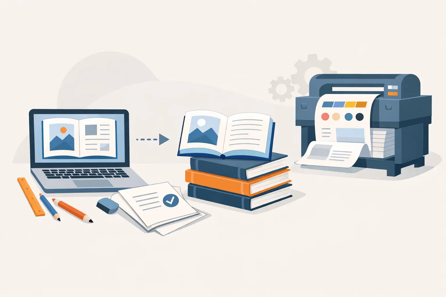
A manuscript can read perfectly on screen and still fail as a print book. A chapter opener may land on the wrong page, a header may crowd the trim edge, or a full-page image may reveal a thin white line after cutting. To prepare book files for printing is to turn finished writing into a controlled production file - one that a printer can reproduce predictably and a reader can trust.
This stage is not cosmetic. Print preparation establishes the physical reading experience: page size, typographic rhythm, image quality, binding allowance, and the final relationship between the interior and cover. Treat it as production work, not a last-minute PDF export.
Start With the Printer's Specifications
Do not build your interior around a generic page size and hope it translates later. Select the trim size, binding type, paper option, ink choice, and distribution route before final layout. A 6 x 9 inch trade paperback, a 5.5 x 8.5 memoir, and an 8.5 x 11 workbook have different demands for margins, line length, image placement, and page count.
Your printer or print-on-demand provider will publish an interior-file specification sheet. Use it as the source of truth for accepted PDF standards, bleed dimensions, minimum resolution, embedded fonts, color requirements, and page-count rules. Specifications can vary by printer, and a file accepted by one service is not automatically ready for another.
Paper choice matters early, particularly for image-heavy nonfiction. Cream paper can support long-form fiction comfortably, while white paper often gives diagrams, photos, and workbooks more contrast. The choice affects perceived color, page thickness, and spine width. If you are creating a hardcover, confirm whether the printer requires a separate case-wrap cover format and whether the interior needs different margin allowances.
Build the Interior Around Trim, Margins, and Binding
Trim size is the final cut size of each page. Your document dimensions should match that size unless a page includes artwork or color that runs to the edge. Those pages require bleed: extra image area beyond the trim line that is cut away during finishing.
A common mistake is treating every margin equally. The inside margin, sometimes called the gutter, needs extra room because the binding consumes part of the page. A 300-page paperback needs more inside space than a 90-page novella. Hardcover binding can require more again. There is no universal setting, so use the printer's minimum as a floor, then make a reader-first decision based on the thickness of the book and the density of the text.
Set the outside, top, and bottom margins to create a deliberate page shape. Fiction often benefits from generous white space and a calm, consistent text block. Dense nonfiction may need to fit tables, examples, and sidebars without making the page feel compressed. The goal is not to maximize words per page. It is to create pages readers can move through without friction.
Use page breaks, not repeated returns
Start each chapter with a proper page break. Never press Enter repeatedly to force a chapter onto a new page. Manual spacing may appear stable during drafting, then shift when a font, paragraph setting, or page count changes.
The same principle applies to section spacing, front matter, and any intentional blank pages. Use layout controls rather than visual improvisation. This gives you a file that can be revised without unraveling.
Establish Professional Typography Before Export
Typography carries more of the reading experience than most authors expect. Choose a licensed, readable body font designed for sustained reading, then set consistent paragraph styles for body text, chapter titles, subheads, quotations, lists, captions, and notes. A manuscript with locally applied formatting becomes difficult to inspect and even harder to update across a series.
Avoid underlining for emphasis in print interiors. Use italics deliberately, and confirm that italicized words remain legible at final size. Be cautious with light font weights, narrow typefaces, and very small text. What looks refined at 150 percent zoom can look weak or cramped in a paperback.
Control widows and orphans, meaning isolated lines at the top or bottom of a page. Also look for short final lines in paragraphs, awkward chapter-title breaks, and headings stranded at the bottom of a page. These details are not vanity. They signal whether the book was produced with care.
Front matter should be intentionally ordered. Most books need a title page, copyright page, and the opening of the main text. Dedications, epigraphs, contents pages, acknowledgments, and author notes depend on the book. Use Roman numerals for front matter only if that convention serves the work and is applied correctly. For many contemporary trade books, a clean approach with Arabic numbering beginning at Chapter One is the better choice.
Prepare Images, Tables, and Bleed Pages Correctly
Images pulled from the web are often unsuitable for print, even when they look sharp on a monitor. Print files generally need images at their final placed size with sufficient resolution, commonly 300 ppi for continuous-tone images. Enlarging a small image inside the layout does not create missing detail. It creates a softer, sometimes visibly pixelated result.
Use the right color approach for the printer. Many print workflows request CMYK images or accept RGB PDFs that are converted during production. Follow the specific requirement rather than converting blindly. A color conversion can shift bright blues, saturated greens, and deep blacks, so proof any image where color is meaningful to the book.
For full-bleed art, extend the image past the trim boundary on every edge that reaches the page edge. Keep vital details, text, faces, and diagram labels safely inside the live area. Cutting variation is normal in commercial printing. Bleed protects the edge; safe margins protect the content.
Tables deserve special scrutiny. If a table cannot be read at the selected trim size, do not solve the problem by shrinking it into tiny type. Rebuild it, split it across pages, change the orientation where appropriate, or move detailed material to an appendix. Reader usability is more valuable than preserving a spreadsheet-like layout.
Export a Print-Ready PDF, Then Inspect It Like a Production File
A print-ready PDF is not simply a document saved as a PDF. It should preserve the final page dimensions, fonts, images, and layout without substitutions or reflow. Export using the PDF preset required by your printer, and include bleed only where the printer requests it.
Before upload, inspect the PDF page by page at normal reading size, then inspect technical details at higher zoom. Check that page count is final, facing pages align as intended, and all blank pages are intentional. Search for missing glyphs, replacement fonts, broken ligatures, clipped images, unexpected color shifts, and visible crop or bleed errors.
Pay particular attention to these production failures:
- Page numbers that appear on a chapter-opening page when your design omits them.
- Running headers that carry the previous chapter title onto a new chapter.
- Text or images placed too close to the trim edge or inside gutter.
- Blank pages caused by accidental section breaks or incorrect recto-page rules.
- Low-resolution images, black-and-white art that prints muddy, or rich black used inconsistently.
A structured production platform such as Forge Live helps keep editing, interior layout, print-ready PDF creation, and EPUB validation in one workflow. The point is not to remove author judgment. It is to give that judgment a dependable system, especially when you are managing revisions, recurring releases, or multiple editions.
Upload Early and Order a Physical Proof
Upload the completed interior before you consider the project finished. Printer previews can reveal issues that are difficult to spot in your layout application, including trim warnings, page-size mismatches, and objects outside the printable area. Resolve warnings rather than assuming they are harmless.
Then order a physical proof. Screen review cannot tell you whether the gutter feels tight in the hand, whether chapter pages have enough visual authority, or whether a grayscale image holds detail on the chosen paper. Read the proof as a reader would, but also inspect it as a producer. Flip through spreads, open it near the middle, examine the first and last pages, and check every page containing a table, image, special symbol, or decorative element.
Proofing may reveal a trade-off. Slightly larger margins can improve comfort but add pages and increase print cost. Larger type can serve accessibility and genre expectations while expanding the spine. There is no single correct answer, only a decision that supports your reader, format, and release plan.
A print book earns confidence through small decisions that hold together: a stable text block, clear images, intentional blank space, and pages that survive the realities of cutting and binding. Give the file the same editorial attention you gave the manuscript. Readers may never name the production choices, but they will feel the difference every time they turn a page.
Last updated September 1, 2026
← All posts