Cinematic Book Trailer Examples for Authors
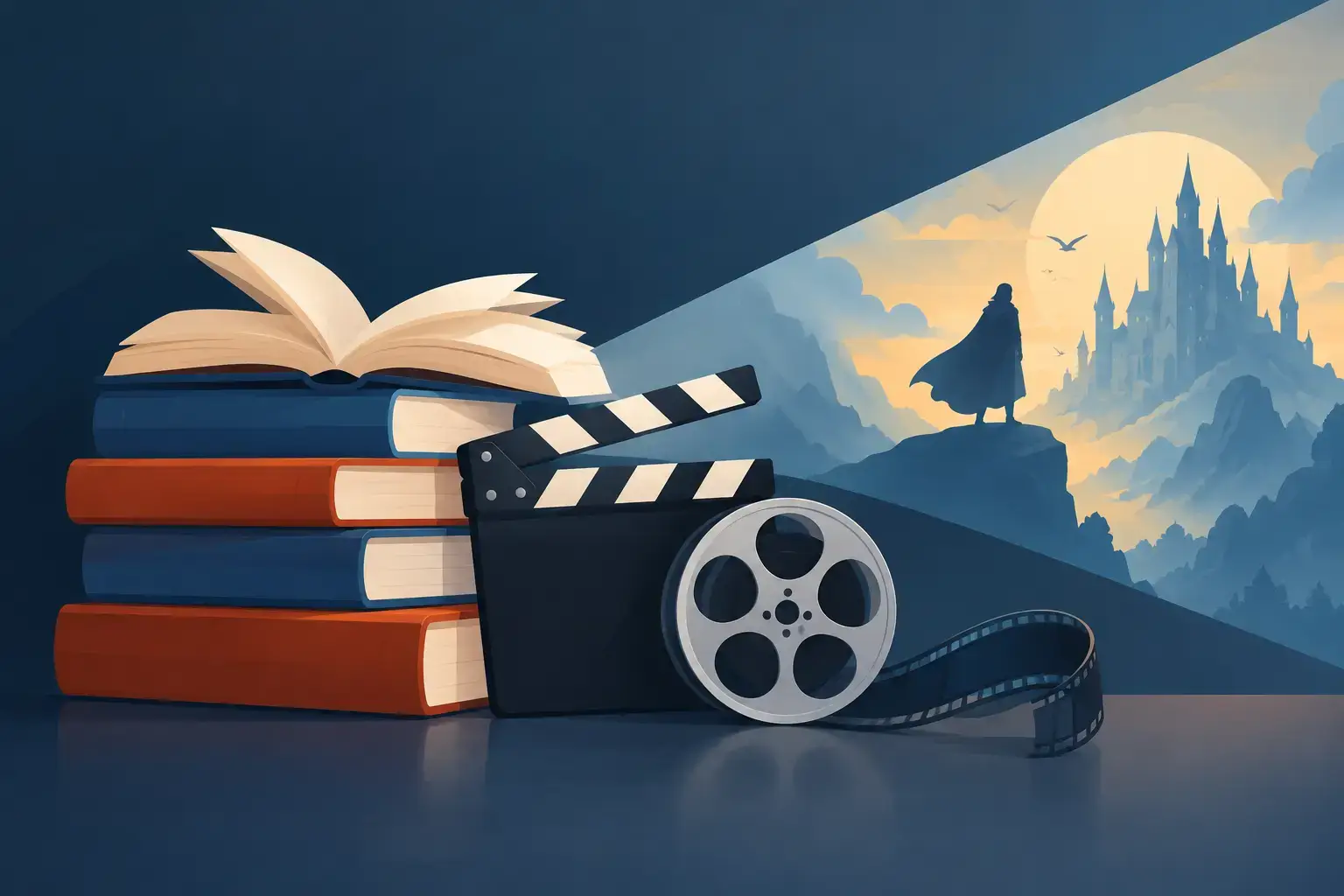
A trailer can make a reader feel the temperature of your story before they know its plot. The strongest cinematic book trailer examples do not try to summarize 90,000 words in 60 seconds. They create one clear emotional promise: a romance that hurts, a mystery that tightens, a fantasy world worth entering, or a threat that will not let go.
For authors, that distinction matters. A trailer is not a miniature film adaptation, and it is not a slideshow of cover art and review quotes. It is a controlled piece of visual storytelling built around the same character, tone, and stakes that make the manuscript work.
What makes a book trailer feel cinematic?
Cinematic does not simply mean expensive. It means every creative choice supports a deliberate viewing experience. The lighting establishes mood. The camera movement creates proximity or unease. Sound design gives silence weight. Short lines of on-screen copy deliver the story's central tension without explaining too much.
A cinematic trailer also has a point of view. Rather than showing every major character and location, it may stay close to one figure: a woman running through a rain-soaked station, a detective studying an empty nursery, or a prince holding a letter he was never meant to read. That restraint gives the audience room to imagine the book.
The right approach depends on genre and budget. A lush fantasy trailer may need environmental imagery and a sense of scale. A literary novel may work better with one intimate voiceover, a few precise details, and carefully paced sound. The goal is not to imitate a studio release. The goal is to make the book look and feel like a property with a distinct world.
10 cinematic book trailer examples to study
1. The thriller cold open
Open on a visual question: headlights cutting through fog, a phone vibrating on an empty kitchen table, or a child's bicycle abandoned at the edge of the woods. Let the sound arrive before the explanation. A single line such as, "She disappeared twice," can do more work than a paragraph of setup.
This format works because thrillers sell urgency. Keep the cuts tight, the color palette controlled, and the copy minimal. End on the title just after the most unsettling image, not after an answer.
2. The romance built around one interruption
A cinematic romance trailer does not need to show every date, kiss, and misunderstanding. Show the moment the connection becomes impossible to ignore: two people reaching for the same marked-up book, a voicemail left but never sent, or a train door closing between them.
Warm natural light, close framing, and a music cue that rises at the right moment can establish longing quickly. The final text should state the emotional stakes, such as "Some promises arrive too late," before revealing the cover and release date.
3. The fantasy world reveal
For epic fantasy, begin with a rule of the world rather than its full history. A crown sinking beneath black water, a map burning at the edges, or a character's hand revealing an unnatural mark can communicate danger and scale without a lore lecture.
Build from detail to landscape. Start with the artifact, then the character, then the wider world. This gives visual effects and generated imagery a practical purpose: they support the story's core conflict instead of becoming decorative background.
4. The horror trailer that holds back
Horror trailers often become more frightening when they refuse to show the monster. Use a hallway that is too dark, a door moving on its own, a breath behind a character's shoulder, or a recording that says something it should not know.
Pacing is the engine here. Start slowly enough that viewers lean in, then break the quiet with one sharp sound or image. Do not dilute the ending with a full explanation. The book is where the reader should find the answer.
5. The historical novel with physical detail
A historical trailer earns credibility through objects. Ink on a ration card. Mud on a hem. A telegram folded into a pocket. A close-up of a typewriter carriage returning can instantly place the audience in a period without relying on a date card.
Choose details that connect directly to the protagonist's problem. A beautiful period costume means little if it does not reveal class, risk, identity, or desire. Pair those images with language that feels specific to the era while remaining accessible to a modern reader.
6. The science fiction signal
Science fiction trailers can become overloaded with planets, interfaces, and technical language. A stronger option is to anchor the future in a human-scale anomaly: a message received from a dead crew, a countdown on a helmet display, or a woman hearing her own voice from a transmission sent decades earlier.
Use interface graphics sparingly and make every screen readable in a second. The audience should understand the danger before they understand the technology. A low-frequency sound bed and clean, high-contrast visuals can make the premise feel expansive without losing emotional focus.
7. The literary fiction character portrait
Literary fiction rarely needs spectacle. A trailer can follow a character through ordinary actions that carry private meaning: setting an extra place at a table, leaving a message unsent, standing outside a childhood home, or watching a familiar street from a bus window.
The voiceover, if used, should be brief and exact. Read one line that captures the book's emotional intelligence, then let the image breathe. This style is especially effective when the prose itself is part of the book's appeal.
8. The young adult identity moment
For YA fiction, show the choice that changes how the protagonist sees themselves. It may be a school hallway, a backstage door, a team locker room, or a bedroom filled with evidence of the life they are expected to live.
Energy matters, but so does authenticity. Avoid generic teen imagery if your story has a distinct subculture, setting, or voice. A trailer for a skateboarding romance should move differently from one for an academic dark fantasy. The visuals should recognize the reader's world, not flatten it.
9. The nonfiction problem-and-proof structure
Cinematic trailers are not only for novels. For nonfiction, begin with the cost of a problem, then show the perspective or transformation the book offers. A founder staring at an empty office, a parent sorting medical paperwork, or an entrepreneur facing a failed launch can make the subject immediate.
Do not turn the trailer into a table of contents. Use one compelling claim, a few purposeful visuals, and the author's credibility where it serves the viewer. The tone should feel assured, not sales-heavy.
10. The series teaser with a final image
If the book begins or continues a series, the trailer should sell this installment while leaving a larger question open. Introduce the central conflict, establish the hero's visual identity, and end with a symbol that signals more to come: a sealed gate opening, a second shadow in the mirror, or a name appearing where it should not.
This approach creates continuity for future assets. The same approved character faces, locations, color treatment, music direction, and title styling can carry into later trailers, social clips, audiobook promotions, and screen-development materials.
Build the trailer from your manuscript, not around it
The most common production mistake is starting with images before choosing the trailer's story beat. Begin in the manuscript. Identify the protagonist, the irreversible problem, the emotional promise, and one visual motif that belongs only to this book. Those four elements are enough to guide a 30- to 90-second trailer.
Then create a simple beat sheet. The opening establishes atmosphere. The middle introduces disruption and raises stakes. The final moments leave the viewer with a question, a feeling, or a deadline. If a scene does not sharpen one of those beats, remove it.
Protect continuity as you build. The character shown in the trailer should match the face approved for future marketing. A key setting should reflect the same visual language as the cover. If narration is included, its voice should fit the audiobook direction rather than sound like a separate campaign. Hermes builds a trailer from the book itself, around one scene, narrated over music, which keeps manuscript details, approved imagery, and promotional assets working from the same source.
Production choices that raise the result
A strong concept can be undermined by avoidable execution issues. Use readable typography, especially on mobile screens. Keep title cards on screen long enough to absorb. Mix music and dialogue so neither fights the other. Most importantly, make the cover reveal clean and intentional.
Length is a trade-off. A 15-second teaser can create curiosity for a launch announcement, while a 45- to 60-second trailer gives room for atmosphere and narrative escalation. Longer is not automatically more cinematic. If the trailer reaches its emotional peak at 38 seconds, end it there.
Before release, watch it once without sound and once without looking at the screen. Without sound, can a viewer follow the mood and essential premise? Without images, does the audio create tension and clarity? Those two checks reveal whether the trailer works as a complete production rather than a collection of attractive assets.
The best trailer leaves a reader with one thought: I need to know what happens next. Build toward that feeling, approve every creative choice, and let the manuscript remain the source of the promise.
Last updated November 21, 2026
← All posts